Understanding the challenge 🔎
Friday’s website served its purpose for a long time, but had become stale and outdated.
It suffered from excessive copy and wasn't up to par with developing accessibility standards.
In terms of look and feel, it lacked a human touch, and didn’t reflect the team’s output in terms of quality.
Finally, the design system was limited and constrained content to a rigid and repetitive form factor.
User research findings 📋
Through user testing, interviews, surveys and an internal UX audit, we identified where user expectations weren’t being met:

Goals 🎯
In order to address our research findings, we established some clear goals:
Copywriting: Communicate the agency's personality with confidence.
Creative spark: Expand and inject some life into the UI and design system.
Highlight metrics: Show exactly how we helped our clients.
People first: Add imagery of the lovely folks of Friday Agency.
Copywriting workshops ✍️
We took part in a series of copywriting and tone of voice development workshops with a copywriting expert.
This massively helped to dial in the appropriate style of messaging to match the agency’s people and work; approachable yet professional. Authoritative with playful energy.
Concept development 💡
Our design team started ideation for a general look and feel. A broad net was cast for competitive research across various industries. Moodboarding, group presentations and an iterative approach lead to a plethora of conceptual directions.
Ultimately, a concept of mine was selected and carried forward into the next phase of development.
SEO and visibility 👀
A huge part of the project was working in tandem with the digital marketing team in fine-tuning our SEO and content strategy.
As part of these efforts, the site map and information architecture was continually evaluated with the DM team in terms of viability.
Accessibility 🚹
Going above and beyond WCAG guidelines was important to us. As big advocates for accessibility, AAA status was aimed as the default where possible, and at least compliant AA everywhere.

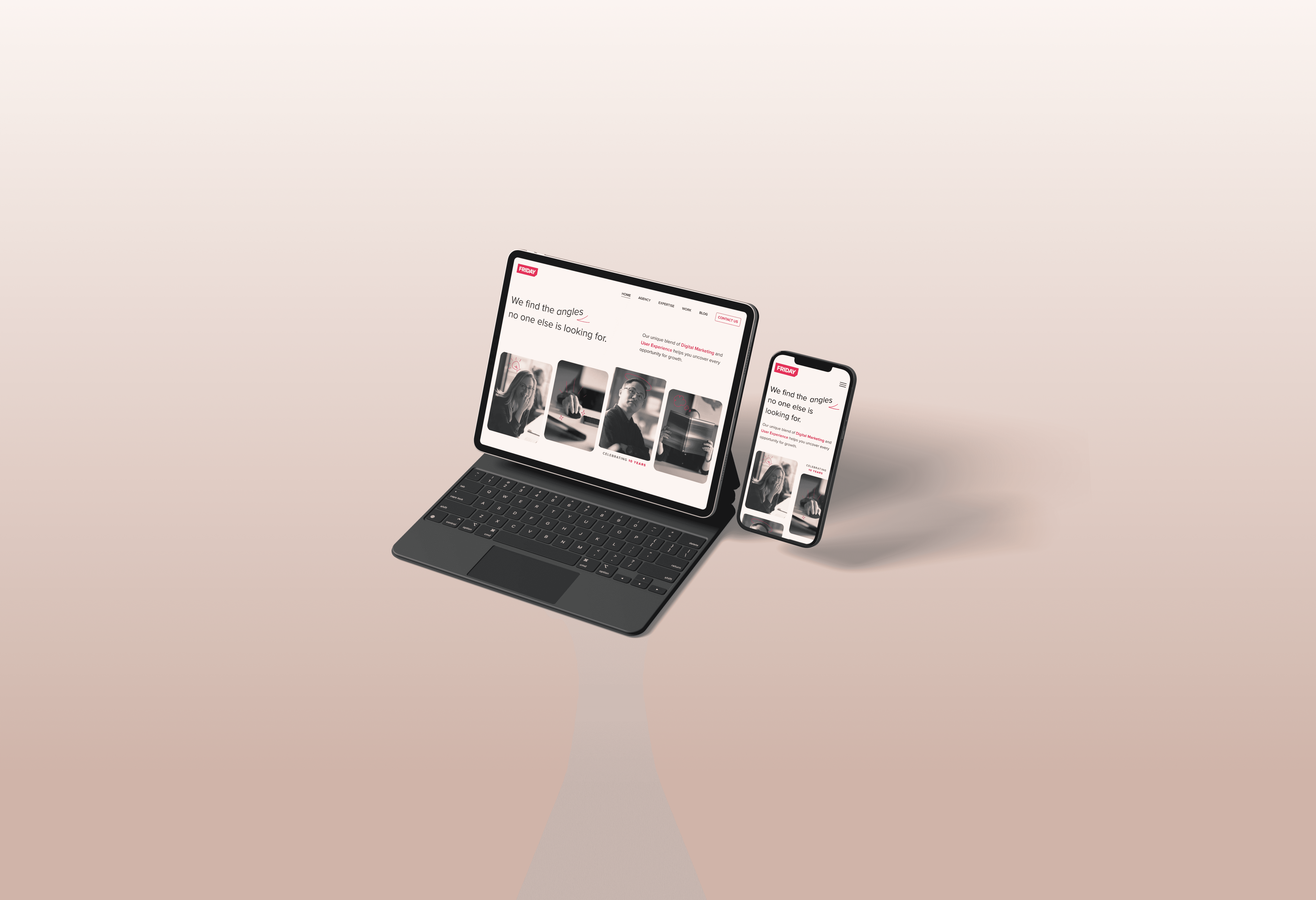
The completed site conveyed the agency's work, people and attitude in a much more well-rounded and dynamic way.
Case studies now had an extensive set of UI blocks to adapt to whatever content was needed.
Animation, imagery and other visual assets elevated the creative impression made on users.
Accessibility efforts showed that the agency doesn't just talk the talk when it comes to going above and beyond compliance.
The team kept a close eye on how the site performed post-launch, with greatly positive outcomes in terms of engagement and search visibility.
Part of this effort was an extensive content strategy, including regular blog posts. Check out some of my writing on the Friday Blog.

