My role 👋
As part of a small design team of 3, I was the senior designer in charge of client liaison, design briefing and UX/UI design. I participated in research and user testing but did not have a leading role in the planning / organisation.
Understanding the challenge 🔎
Peter Mark came to Friday Agency with a frustratingly outdated e-commerce platform.
They didn’t have enough control over content to keep up with product updates and supplier requests, plus they had issues in the sales funnel with poor information hierarchy and a clunky checkout process.
They knew their bounce rate was holding them back, particularly on mobile, where most of their customers were coming from.
User research findings 📋
Tree-testing, customer surveys, interviews and user testing highlighted poor navigation and unstructured information architecture.

Design brief 🖊
As standard practice at Friday, I created and led the client through a thorough design brief, outlining the strategic and aesthetic direction the solution would aim to achieve.
The fun part 🎉
The meat and two veg of the project:
Site maps and wireframes setup the navigational structure of the site.
UI concepts and client approval of initial screens.
Iterative UI design, involving desktop and mobile prototypes for client presentation and review.
User testing on a functional prototype took place towards the end of the process, which highlighted some key changes to be made.
Navigation posed a particularly interesting challenge 📍
The solution had to strike a balance of simple enough to be intuitive, but also flexible enough to filter and narrow down the options via categorisation.
Iterations came by way of many a deep dive into navigation systems on various existing e-commerce sites - some too heavy and overwhelming, others too basic to meet Peter Mark users' needs.
A few functional wireframe prototypes sparked internal debate. Ideally, user testing would have been conducted on wireframe version of the navigation. However, budget constraints meant that testing would be better put to use on a high-fidelity prototype.
User testing outcomes 🔬
General sentiment and task completion was greatly improved overall.
Feedback emphasised the importance of concise product descriptions and visible key words. With a few tweaks to visual hierarchy here and there, we were ready for development handover.


The solution ✅
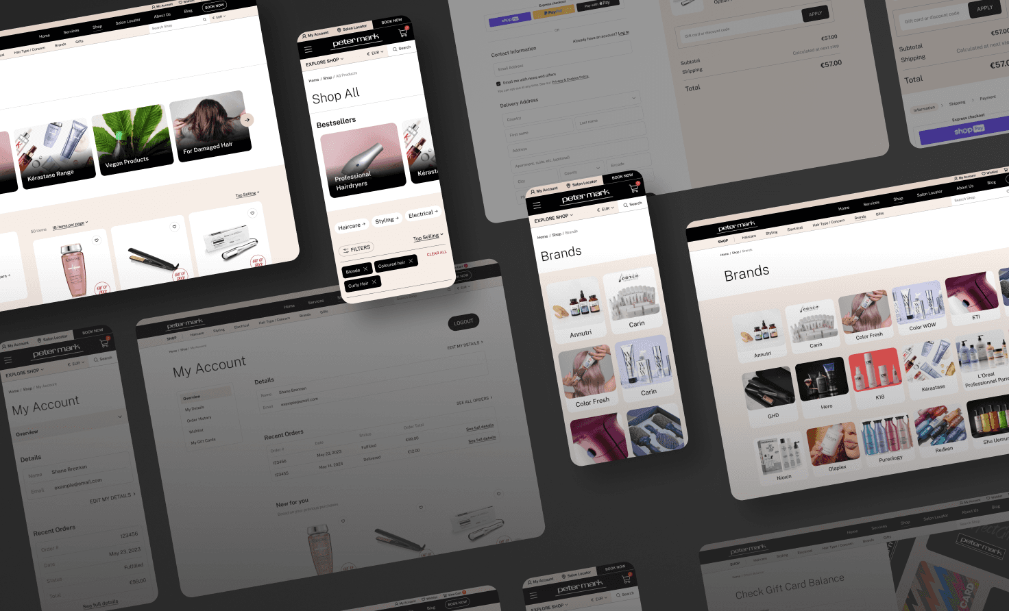
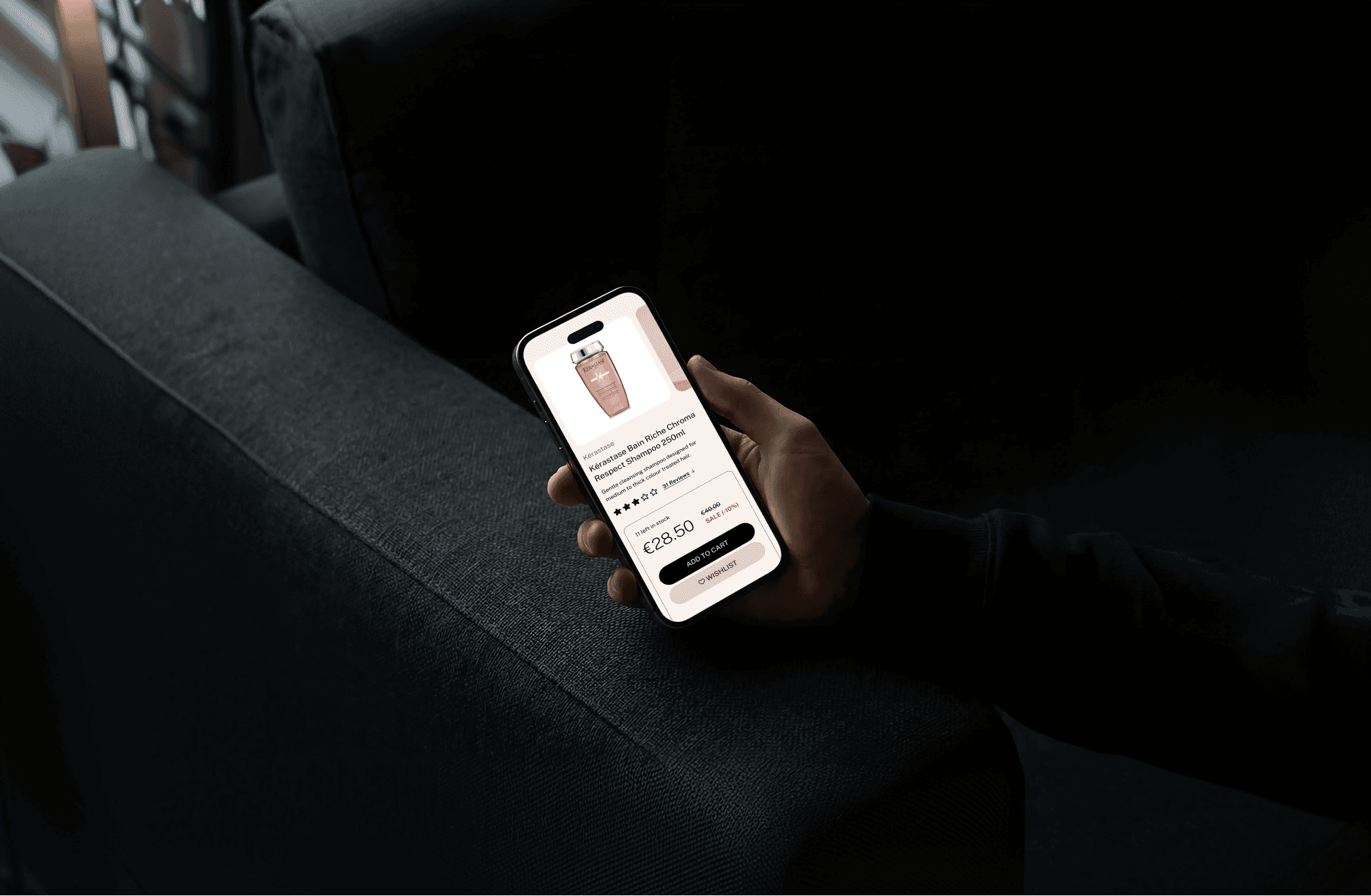
The simplified shopping experience was mobile-optimised, search and filter flexible, as well as visually balanced with key product details and imagery.
A custom Shopify Plus storefront allowed the client to have exponentially greater control over brand content and store admin.
The results 📈
Knowing exactly what users were tripping over in the old system gave the solution serious focus.
As most customers were on mobile, intuitive category navigation and filtering was essential, as was including specific 'hair concern' key words for scan readers.
Design decisions were validated through testing, and particularly emphasised by users was the importance of high quality imagery throughout the site, of both products and hair styling services.
See my work on the Peter Mark website.